Today I’m sharing my process on photographing and editing my chamomile tea images. I’ll explain the setup, the shoot, and the edit in Lightroom.
I adore chamomile. As I drive along I’m always scanning ditches, and right now this exuberant little flower nods, and waves, and beckons me.
I will acknowledge some people regard it as a (noxious) weed, but I regard it as a wildflower full of possibilities … photography, a bouquet, tea … certainly something to be celebrated.
I do not make my own chamomile tea (I leave that to the experts) but it is probably my favourite tea. It warms, it soothes, and it calms. Apparently it has medicinal properties and any Google search will attest to that. But today I simply want to explain my photography process.
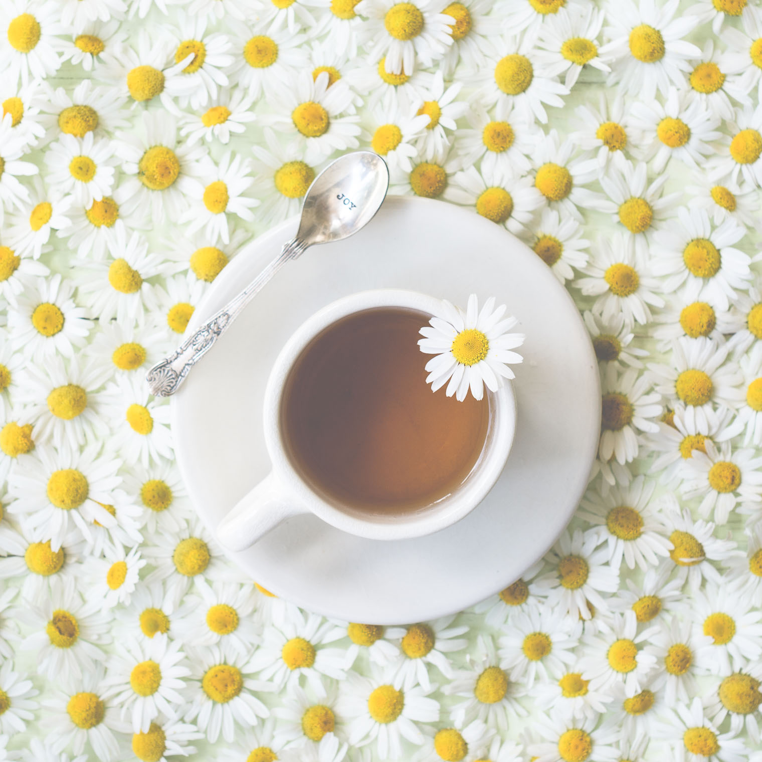
I set a cup of tea on top of the green door which I dragged home a few weeks ago. I chose the green door since I thought the white flowers needed contrast. I then painstakingly lovingly, clipped the flowers off the stems and arranged them closely, leaving one on a stem so I could prop it in the teacup.
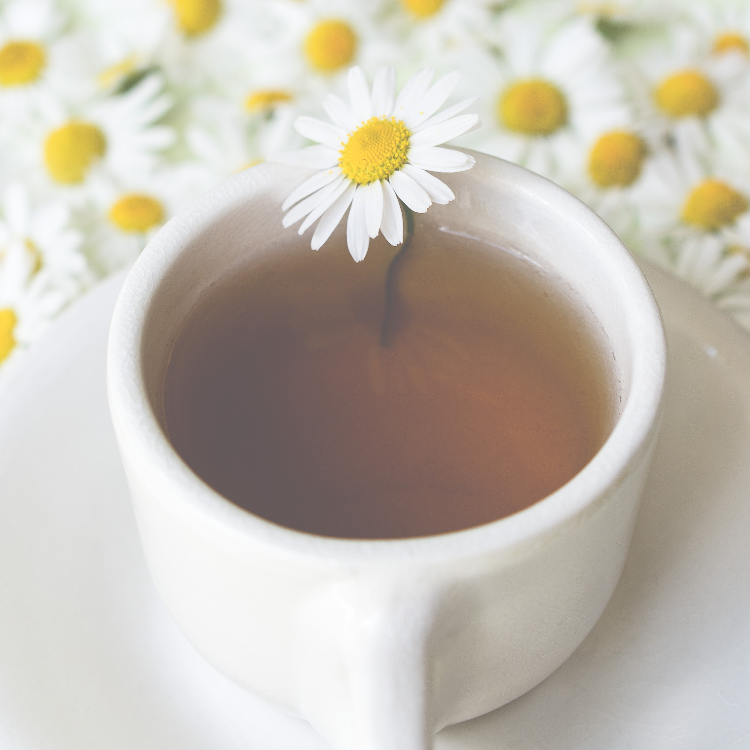
In the following images, the one flower is my focal point. I used f5.6 to blur the background, but not too much.
Camera Settings:
- Nikon D7100
- Nikon 40mm lens
- 1/125s f5.6 ISO 160
- No flash
I was thrilled to have this image featured by @poppytalk (IG) and on their blog Poppytalk: Tuesdays Summer Colours
kk_Hazed
Since my photos were a bit overexposed in camera, when I imported into Lightroom, I did not apply an Auto Tone. I wanted complete control to tone manually, and on an individual basis.
After cropping and straightening, I applied Kim’s kk_Hazed Lightroom preset … and kaboom! magic!! Dreaminess with a click of a mouse … the one thing I loved most was the softening haze it put over the tea …
kk_Hazed

kk_Hazed
After that I simply grabbed the Adjustment Brush and brushed over the prominent flower, bringing back some sharpness.
Then I decided to experiment just a little … I wanted the images to be “less green”.
To do this, I clicked on Color in the HSL/Color/B&W tab in the Develop Module, chose Green and moved the slider to the left to desaturate … what do you think?

Do you prefer more green, or less green?
I’m undecided … I’ve printed one copy of each and am still debating … I’ll let you know …
Thank you for stopping by today!
Barb, I thought I would like better the version without green but it seems to me that that image is not whiter as I expected by has a reddish tint when looked at in detail. In such a case the version with green appeals to me much more. Those colours… :)
Thank you for reminding me that preset can be locally counterbalanced by the Adjustment Brush, good to realize that!
Thank you Petra! I always get tripped up by reddish tints – I don’t see them until later. I truly appreciate the feedback.
Lovely Summery photos Barb ! I love how you arranged all those individual flowers. I think I prefer the one with more green, but I can’t say why !
Thank you Caz!
Barb
I love reading your blog each week. I think I would have to print the image to decide which one.
Tho personally I would be inclined to lean toward the one with less color than more in the background.
I am looking forward to trying out your Sunday sundries now that I got my computer back.
Thank you for your support and your continual inspiration.
Ann
Thank you so much Ann! I’d love to see you here!
Your creativity blows my mind and you never cease to amaze and inspire me!!!
Thank you sweet Carolyn! xo
Barb, These are simply gorgeous! I agree with your friends, I’d base my choice on how the photo prints. But from my monitor version, I’d choose the version that is a little less green – but they are truly beautiful, every one!
Thank you Donna!
I am curious for your overhead shots do you have your camera mounted or do you stand over? You are so talented!! Thanks for sharing. I have so much to learn.
Hi Rhadonda … thank you so much for your kind comment! I will sometimes use a tripod for my overhead shots, but usually I just stand over top using a slightly faster than usual shutter speed. I bump up the ISO and use a aperture of no more than 5 or 6. Hope this helps!